

Colour stimulates our emotions. It establishes the mood of a work of art and heightens our response. And it has done so since the dawn of civilisation. Even the prehistoric cave painters of Lascaux in France, more than 15,000 years ago, understood the impact of adding colour to their primitive depictions of animals.
Elemental colours
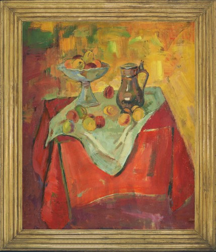
Theories around the use of colour in art first became prominent during the 1400s. In his book ‘On Painting’, Leon Battista Alberti identified four key colours to represent the elements – red for fire, blue for air, green for water and grey for earth – and recognised that mixing colours brought the potential for “infinite other hues”. Colours continue to be important even in modern paintings, as exemplified in Henri Ramaeker’s La table aux fruits, a blend of elemental colours that work together in harmonious balance.
Alberti’s belief was that painters should use particular colours in a deliberate and calculated fashion to evoke emotions. For the artists of the High Renaissance, such as da Vinci or Raphael, look for red symbolising sin or greed or green to denote balance, resurrection and baptism. Later, Canaletto used green in his paintings of Venice to imply order and harmony.
A rational response
Sir Isaac Newton’s experiments with prisms during the 17th century added a scientific layer to our understanding of colour. Newton famously proved that white light could be separated into seven colours – otherwise known as the spectrum. This discovery paved the way for thinkers such as Goethe who, in his 1810 book ‘Theory of Colours’, declared that red, yellow and blue were primary colours and every other colour was a combination of these three.
A colour explosion
The Impressionists of the 19th century were more concerned with emotion than theory. Painters such as Monet and Pissarro aimed to ‘capture the moment’ in their work, so the effects of light could easily transform an object from its expected colour into something radically different. The Impressionists’ response to colour was a dramatic break from convention and freed artists to experiment even further.
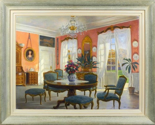
Artists have always wanted to be different when it comes to expressing their art, which can be done through the use of colours. For instance, Interior in Overførstegaarden, Denmark, by Adolf Heinrich Hansen, defies conventions by using light colours to create a detailed, airy interior, which, in paintings such as these, is typically associated with dark colours.
In the 20th century, none heeded this invitation more so than Mark Rothko. The American Abstract Expressionist produced huge canvases, such as his epic Seagram murals, which were designed to overwhelm the viewer with pure colour and evoke the same emotional response that Rothko experienced when he painted them.
The gallery at Mark Mitchell Paintings and Drawings reflects many of these major theories about the use of colour in art. If you would like any more information on our collection of oil paintings, watercolours and drawings from the 19th century onward, contact us today.